Museums For All
Project Members
- Elvira Alonso: designer, researcher
- Dana Chung: designer, researcher
- Jamie Kasulis: designer, researcher
Problem and Solution Overview
We set out to make museums more accessible– but for whom? During our research, we learned that WCMA and museums in general are often inaccessible to people of color. This is not just an issue at WCMA but at art museums across the nation, according to a report by NPR.
The good news is that WCMA is working to specifically address this problem by facilitating discussion with the community. The bad news is that members of the community, including those who might benefit the most from these discussions, are not necessarily aware of these discussions. A second limitation is the fact that the discussions are only available to those who attend, and that the discussions do nothing to benefit visitors while they are experiencing the museum. We observed negative emotional experiences during our research, and these facilitated discussions do nothing to help them.
Thus, our proposed solution is essentially a discussion platform installed into the museum itself that becomes its own piece on display. We want the installation to not only provide concerned visitors with a platform to have their voices heard, but to also archive and display these discussion points in the museum. The goal is for the discussion to happen immediately, and for people’s voices to not disappear into the void and instead be heard by the community and centered in the museum experience. Toward that end, our museum installation has an accompanying display at the front of the museum that showcases users’ comments (more info on this below).
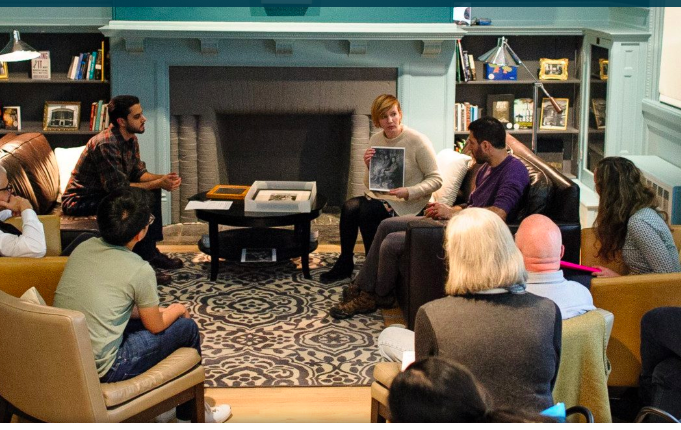
Figure 1: WCMA Discussion - Reading Room
Design Research Goals, Stakeholders, and Participants
We conducted two contextual inquiries and three semi-structured interviews for our research. We had no particular selection criteria for our contextual inquiry subjects except that they must not be individuals we know and not identify themselves as “art people.” We did this with the hope that our data would reflect the experiences of those for whom the museum might be most inaccessible. We also interviewed three WCMA staff members to learn more about the work they do with the museum and how they tackle issues of inaccessibility.
Design Research Results and Themes
As we were reviewing the data we gathered from our contextual inquiries and semi structured interviews, some of the major themes present were a need for accountability and accessibility. We discovered that people are more likely to engage with art if there is a sense of familiarity. From these discoveries, it became clear to us which tasks we had to accomplish. Our designs should help connect museum visitors engage with art by making museums more comfortable and centering the narratives of PoC by sharing them or making them more accessible.
Answers to Task Analysis Questions
Based on our contextual inquiries and interviews, we were able to discover that PoC may not feel comfortable in museum spaces for a number of reasons. One of the most prominent reasons we observed was a dislike in the way the museum displayed PoC and how they handled PoC issues. People already make their own critiques and interpretations– this is an exhisting task. The new tasks we wanted to implement are sharing these interpretations and fostering discussion about important topics relating to people of color. Our museum installation aims to accomplish these by essentially acting as a discussion platform complete with pre-made prompts that explicitly address expressions of power, discomfort, and marginalization in museums.
Proposed Design Sketches - “3x4”
We designed three different design sketches. The first design we came up with was a mobile app (Figure 2). We envisioned the app as a great way to get both visitors and WCMA staff involved and contributing to discussion relating to museums and exhibitions. We learned from our research that WCMA already holds many discussions regarding issues of cultural appropriation and other concerns. However, not many people are not able to actively contribute. This design supports the following two tasks:
- Support visitors in creating alternative interpretations and critiques of the exhibits during their visit
- Facilitating conversations between WCMA staff/representatives and visitors about exhibits
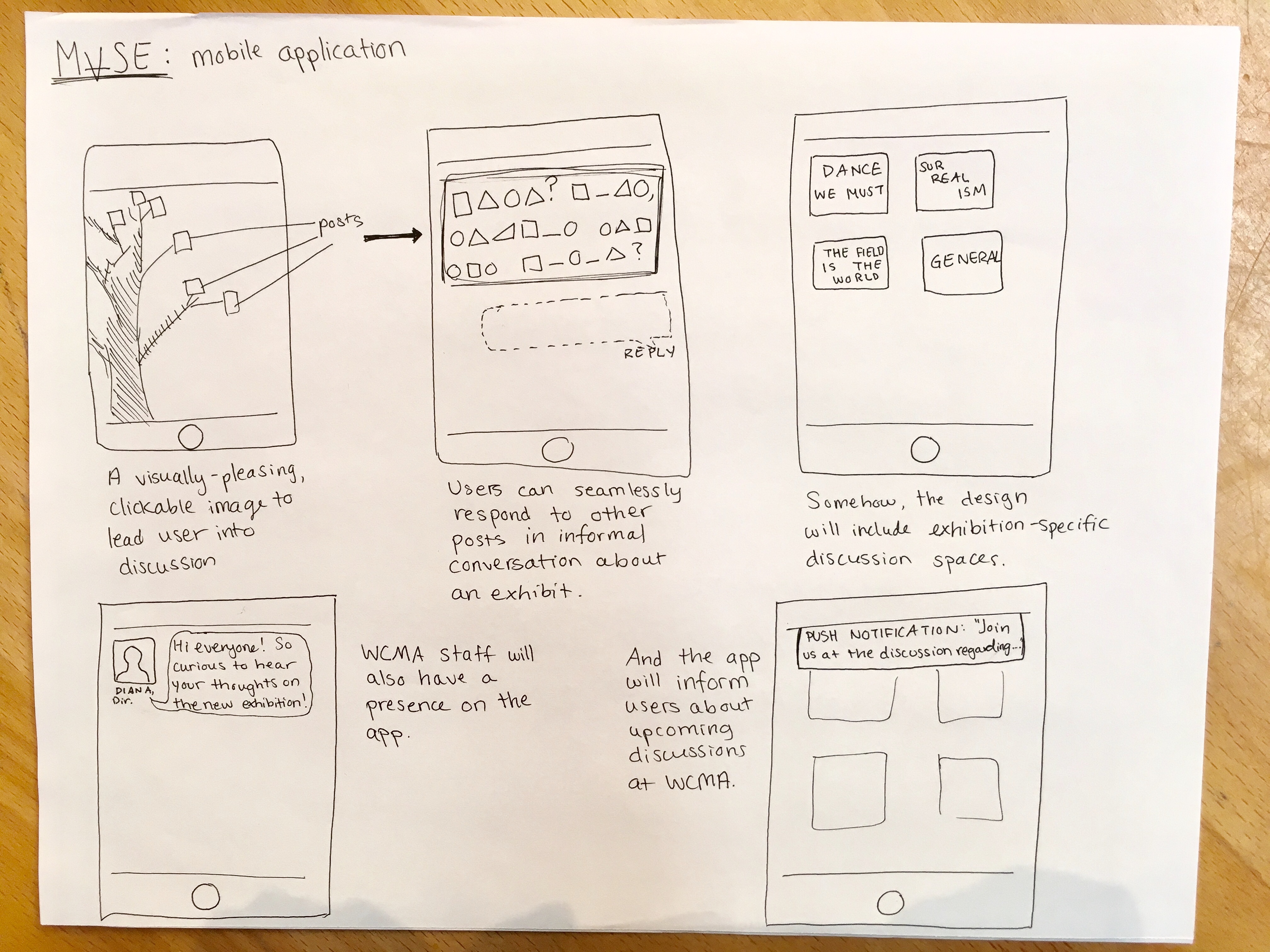 Figure 2: Design sketch of a mobile app.
The second design we came up with was a special headset and device (Figure 3). In this design, a wireless headset in addition to a handheld device similar to a tablet provides context and information about a particular piece of art that visitors are viewing. Visitors are in control of what they want to see and information they want to hear. In addition to listening to curated content, users are able to submit their thoughts via the handheld device. This device can facilitate discussions between museum staff and visitors by being a platform for visitors to share personal thoughts about art. This design supports the following two tasks: 1) Facilitating conversations between WCMA staff/representatives and visitors about exhibits, 2) Support visitors in creating alternative interpretations and critiques of the exhibits during their visit
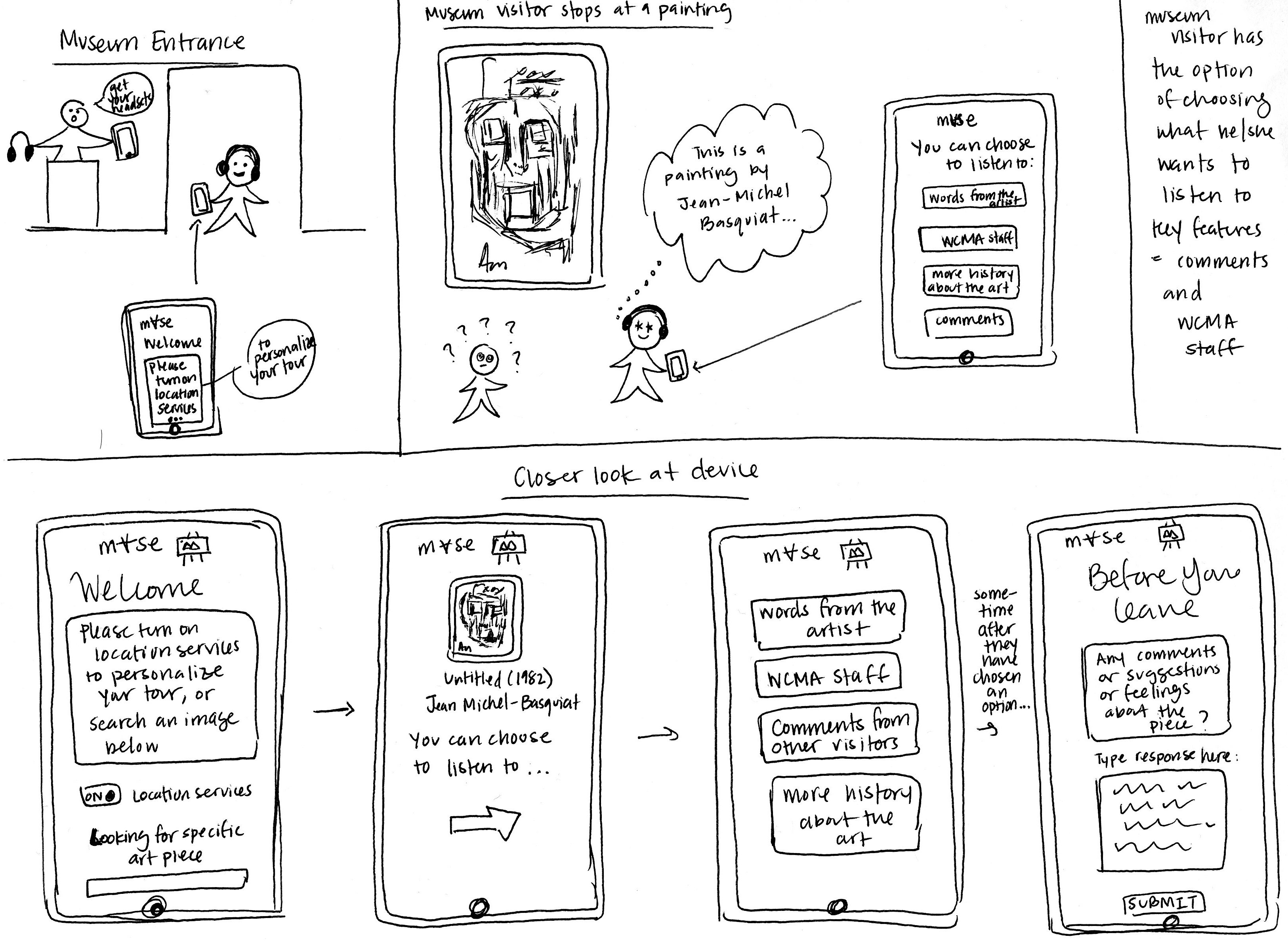 Figure 3: Design sketch for special headset and device
The final design we came up with and ended up choosing for our project is a museum installation (Figure 4). This museum installation is an electronic device that is located in front of pieces of art. We envision this installation to support our new tasks and pre-exiting task that visitors create alternative interpretations and criticisms. This installation allows for sharing of discussions happening at WCMA as visitors can read and share comments and discussions based on prompts or topics. Both museum staff and visitors can create prompts/discussions on difficult topics and controversy that will support the following two tasks: 1) Facilitating conversations between WCMA staff/representatives and visitors about exhibits, 2) Support visitors in creating alternative interpretations and critiques of the exhibits during their visit.
Our design is essentially a discussion board with a twist. We realize this is a pretty traditional thing but we really thought it would be the most conducive platform for the goals of our design. We toyed with a few ideas, such as having people draw their feelings, make their own design to describe their critiques or experiences of the museum, and so on. But we were of the opinion that this would actually be a very disingenuous way to solicit the thoughts and feelings of our users. The issue we are addressing is, to an important degree, the fact that PoC narratives and experiences are not centered in the museum space. We thought it would be contradictory for us to say we wanted to center their thoughts by not actually giving them a platform to write those thoughts down. More importantly, we want the thoughts to be seen and addressed– so that’s why the accompanying display for our design is also an important aspect we are excited about. An additional crucial aspect of our design includes prompts and participation from WCMA curators and staff members. This will provoke conversation and inspire others to share their thoughts even if it was not previously discussed. The actual interface of the application used in the museum installation will emphasize these points.
Another important aspect of this design is that we do not want users’ comments to disappear into the void. Because one of our goals was to combat inaccessibility by centering the concerns of people of color, we want to make sure their comments are seen. Toward that end, accompanying our design is a TV display at the entrance of the museum that shows a slideshow of user comments. (A museum staff member would be able to easily remove inappropriate or offensive comments before they show on-screen.) In this way, the comments our users leave contribute directly to the material in the museum and would take up their own space.
We learned from our research that many people feel museums are inaccessible because of their lack of understanding and conversations about art. We chose this design because a museum installation will help facilitate further widespread conversations and discussions. As opposed to a mobile app that requires visitors to go through extra effort to download, a museum installation supports the user tasks without putting extra burden on the user while maximizing participation and usability. We decided to pursue the following two existing tasks: 1) Conversations between WCMA staff/representatives and visitors about exhibits 2) Visitors create alternative interpretations and critique exhibits during their visit. We are also pursuing the following tasks that will be enabled by our design: 3) Facilitating conversations and making dialogue between WCMA staff/representatives and visitors about exhibits easier to access 4) Support visitors in making/sharing/reading/creating alternative interpretations and critiques of the exhibits that specifically address difficult and controversial topics
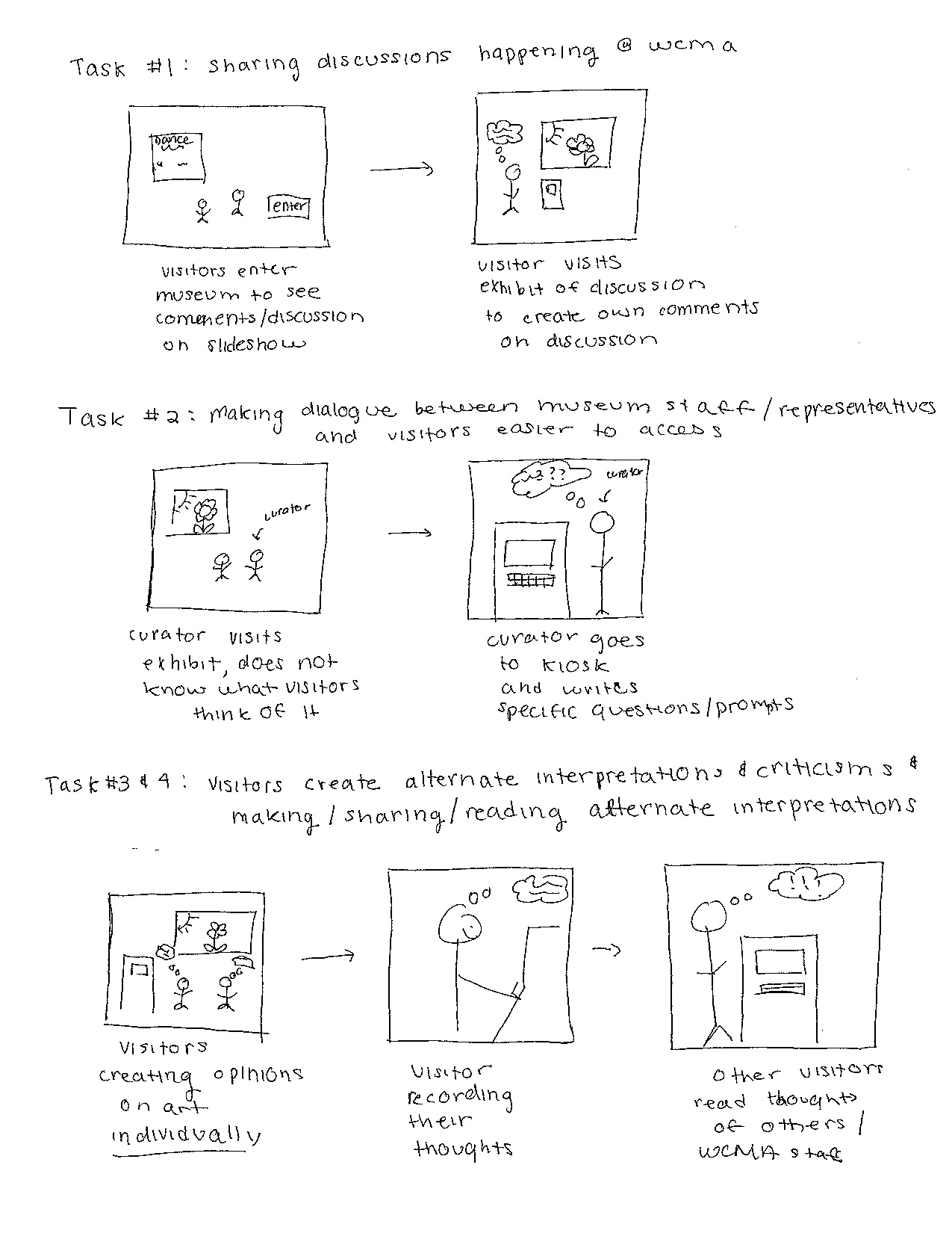 Figure 4: Design sketch for museum installation
Further details about our proposed design sketches can be found here.
Written Scenarios - “1x2”
Task 1: Creating alternative interpretations and Critiques (Figure 5)
In this scenario, Lisa, a museum visitor comes across a painting she finds problematic. She wonders if other people also find this painting problematic and worrisome. As she looks longer at the art, she realizes that although it is problematic, it should be included in the installation because it represents history. As she makes this conclusion, she views the museum installation and decides she wants to share her thoughts. Lisa then goes to the installation and notices that there is an existing discussion already there about the history of the painting. She reads the comments, realizes that other people agree and disagree with her. She types up her response and submits it. She is glad the museum is facilitating these discussions. These discussions are needed for others to understand art and the museum kiosk is an effective way to share her opinion.
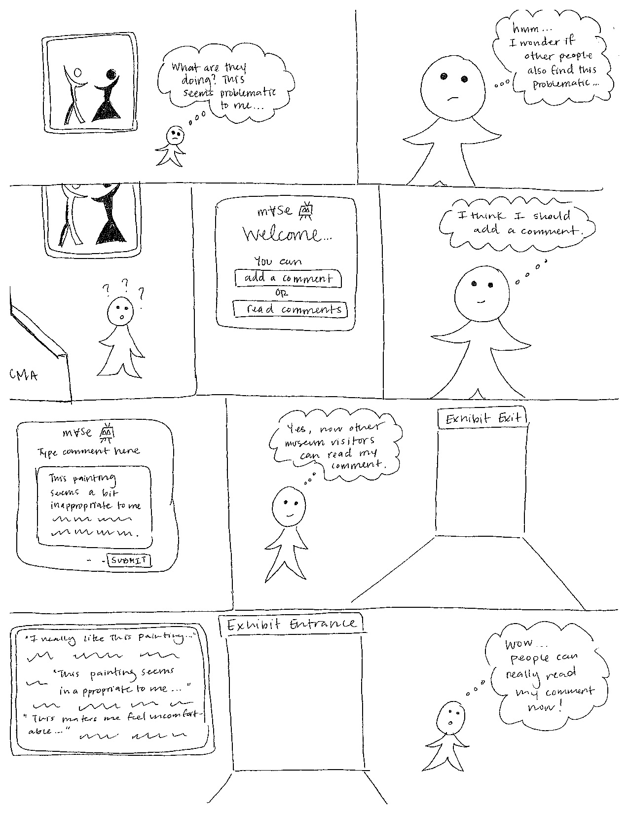 Figure 5: Storyboard of a user creating alternative interpretations and critiques.
Task 2: Reading alternative interpretations, critiques and ongoing discussions (Figure 6)
In this scenario, Alex, a museum visitor comes across a painting she finds problematic. Oftentimes she dislikes going to museums because she feels she can never fully understand art because she can’t share her opinions or know other people’s opinions. When viewing the painting, she notices the museum kiosk and starts to read comments left by WCMA staff members and other visitors. She enjoys reading the comments because they are bringing up points that she had not thought of previously. She then forms her own opinions on the art, realizes that other people agree with her. She also leaves a comment and leaves the exhibit feeling more comfortable because she feels like she can understand and discuss the art at a deeper level.
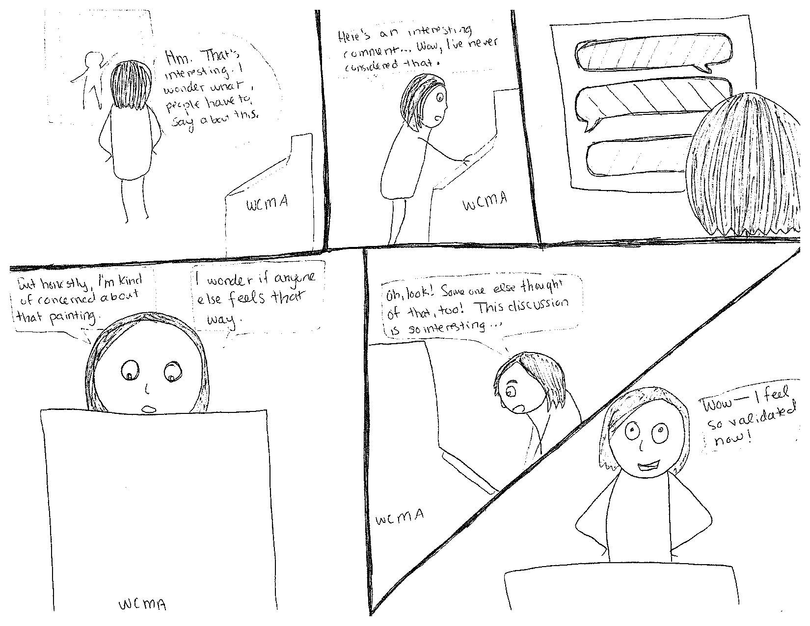 Figure 6: Storyboard of reading alternative interpretations, critiques and ongoing discussions.
Further details about our scenarios and storyboard can be found here.
An Important Note
There are many different and compounding dimensions of privilege, dimension, and marginalization. Our group has chosen to design museums to be more accessible for people of color specifically. This acknowledges a race-based subjectivity that we hope to center. Still, we acknowledge that for any person, many “isms” may come into play– racism, heterosexism, ableism, and more. Rather than try to make an ineffective one-size-fits-all solution to these issues, we narrowed our focus based on what was most salient during our research. However, we do hope to at the very least make our design accessible to those with visual impairments, as it is an ethical concern of ours that our technology may not be physically usable to some. We envision our design being able to provide auto-narration of discussion posts so that users who cannot see the text can hear it.