Museums For All
Project Members
- Elvira Alonso: designer, researcher
- Dana Chung: designer, researcher
- Jamie Kasulis: designer, researcher
Problem and Solution Overview
Initially, we believed that a discussion forum was the best design for making museums accessible to people of color by maximizing visitor participation and usability. Given the nature of this design, we assumed people would have the tools necessary to voice their opinions about artworks and exhibits. However, after further discussion with Iris about our initial project design, we decided to make our design more educational and interactive to help prevent a recreation of existing power dynamics within the discussion space and provide more learning opportunities for our users. In the end, we envisioned an interactive touchscreen display to be placed at the entrance of an exhibit.
We believe that this change will result in a more innovative and useful way of making conversations and exhibitions more accessible to museum visitors. Users will be able to learn more about specific exhibits and based on which one is chosen, as well as the artworks in that exhibit. Furthermore, the can do this by clicking on a topic related to the museum (for example, “cultural appropriation”), allowing a concerned visitor to zero in on the conversations that feel relevant to them.
Rather than relying on discussion to solve the problems we are designing for, we decided to make our design more educational. The context we provide will be pre-written and could potentially be submitted by community members with a vested interest or specialty in these topics, such as professors, interested students, community organizers, or even WCMA staff. Discussion is then a supplemental component of this, but not the sole or main way that we hope to accomplish our design goals.
Initial Paper Prototype
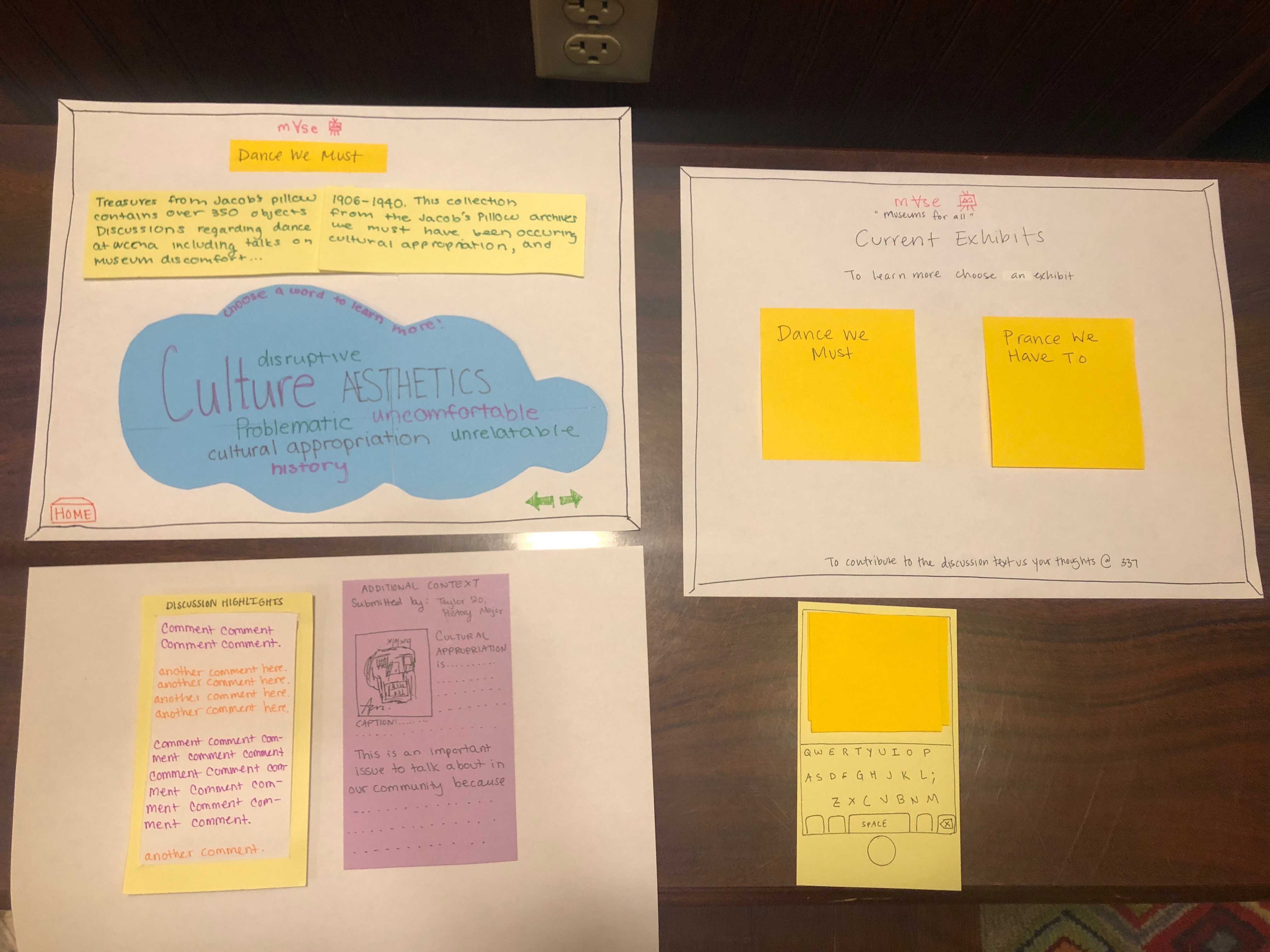
 For our initial paper prototype, we relied heavily on providing a discussion platform to achieve our goals. We quickly learned, however, that this might not be the best approaach to solving the problem at hand. In the beginning, as you can see in the snippet above, we used our design mainly to direct users to the discussion panel. A supplementary context panel was provided, which we intended to provide an educational write-up for users to read before considering the discussion, but the discussion was still our primary component.
Testing Process
In order to test our paper prototype, we first conducted heuristic evaluations along with a walk-through of our prototype. We then proceeded to conducting three usability tests with people of various backgrounds.
For each of our usability tests, we introduced our project with some background about the HCI course we are currently in and a vague description of the goal/purpose of our project. We emphasized the importance of thinking aloud and oversharing opinions and thoughts during the test. We then read a simple background story to the particpant. Then we asked our particpant to complete the first task followed by the second task. Our roles (facilitator, observer) changed for each usability test.
Testing Results
For our heuristic evaluations, the heART group pointed out certain consistency issues in our paper prototype. They also noted that better instructions were needed. As a result, we added ‘?’ buttons and “to contribute to the discussion…” to every screen. As for the cognitive walkthroughs, we noticed that our word choice and not so visible scrollbars may lead to confusion amongst users. This was confirmed during our three usability tests.
For our first usability test we realized that key revisions need to be made. Our participant was confused about the layout of some of our pages and not satisfied with the response messages. These changes are outlined in our usability testing check-in.
As for our second usability test, word choice was a source of confusion. From our heuristic evaluations we changed ‘word’ to ‘topic’ but it seemed as though this was still not clear. Moreover, our participant was interested in replying to a specific comment which we did not design for.
Our third participant was confused about our logo and layout which was also a theme in our first usability test. We decided to change the layout to make our discussion and context pages easier to use. These changes are further discussed in our usability testing review.
Final Paper Prototype

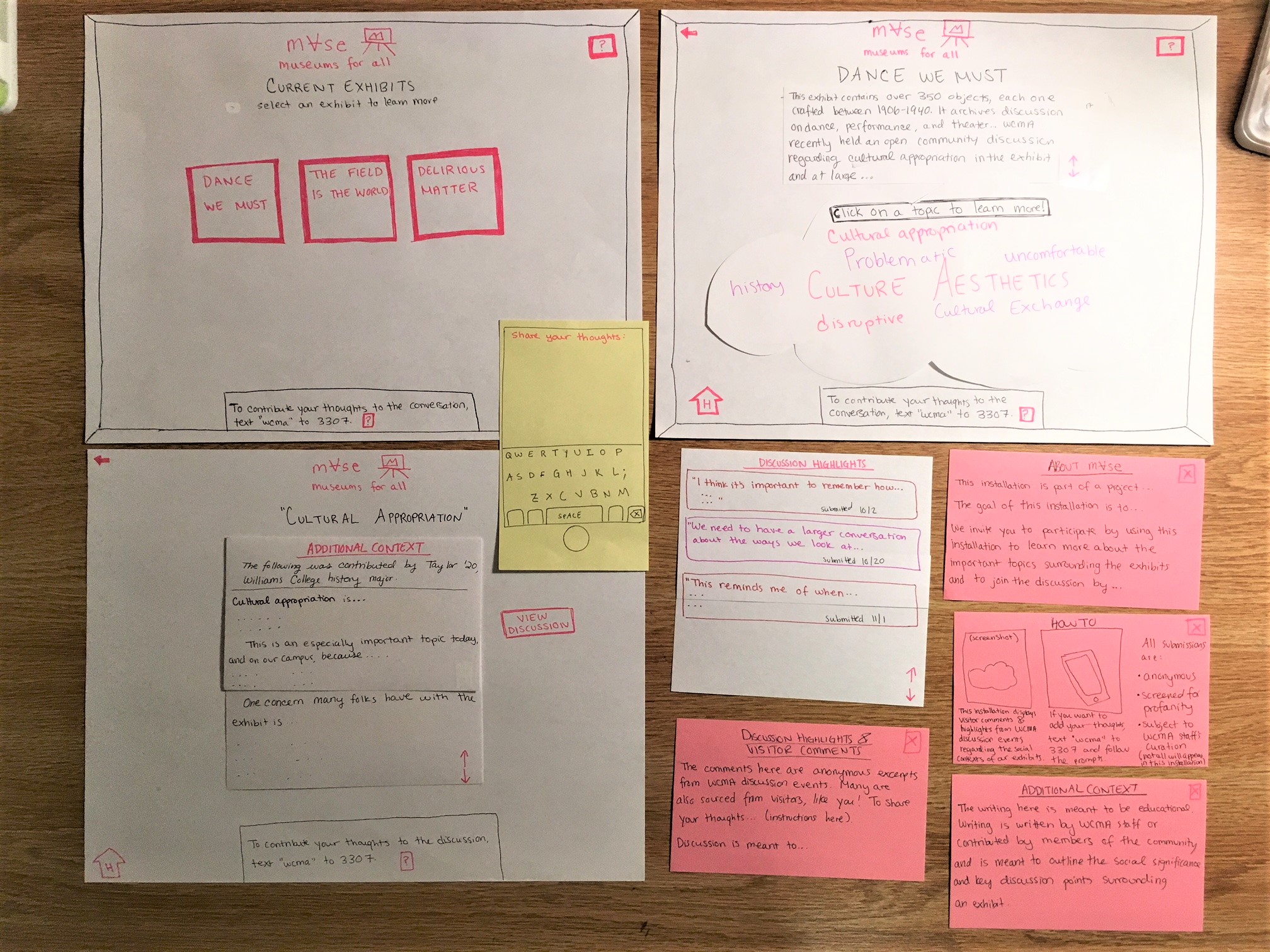
This is our final paper prototype. You can see that we made more of an effort to convey a cohesive color scheme, and we also standardized the placement of items, capitalization of letters, and font use for consistency purposes. We also provided much more detailed instructions for every aspect of our design, including pop-up windows triggered by buttons that provided tutorials on using the installation, an explanation of our project, and information on where we source our content from. We also tweaked how we displayed the Additional Context panel and Discussion Highlights panel– still alongside each other, but with the Discussion requiring an additional button press so as to place the Additional Context (which we deemed more immediately important to a user’s experience) center-stage. This allows the user to accomplish task 1 (learn more about an exhibit and the discussion going on around it) before being confronted with the discussion. Task 2 is accomplished in the same way (by texting in your response), but with more detailed instructions.
Digital Mockup
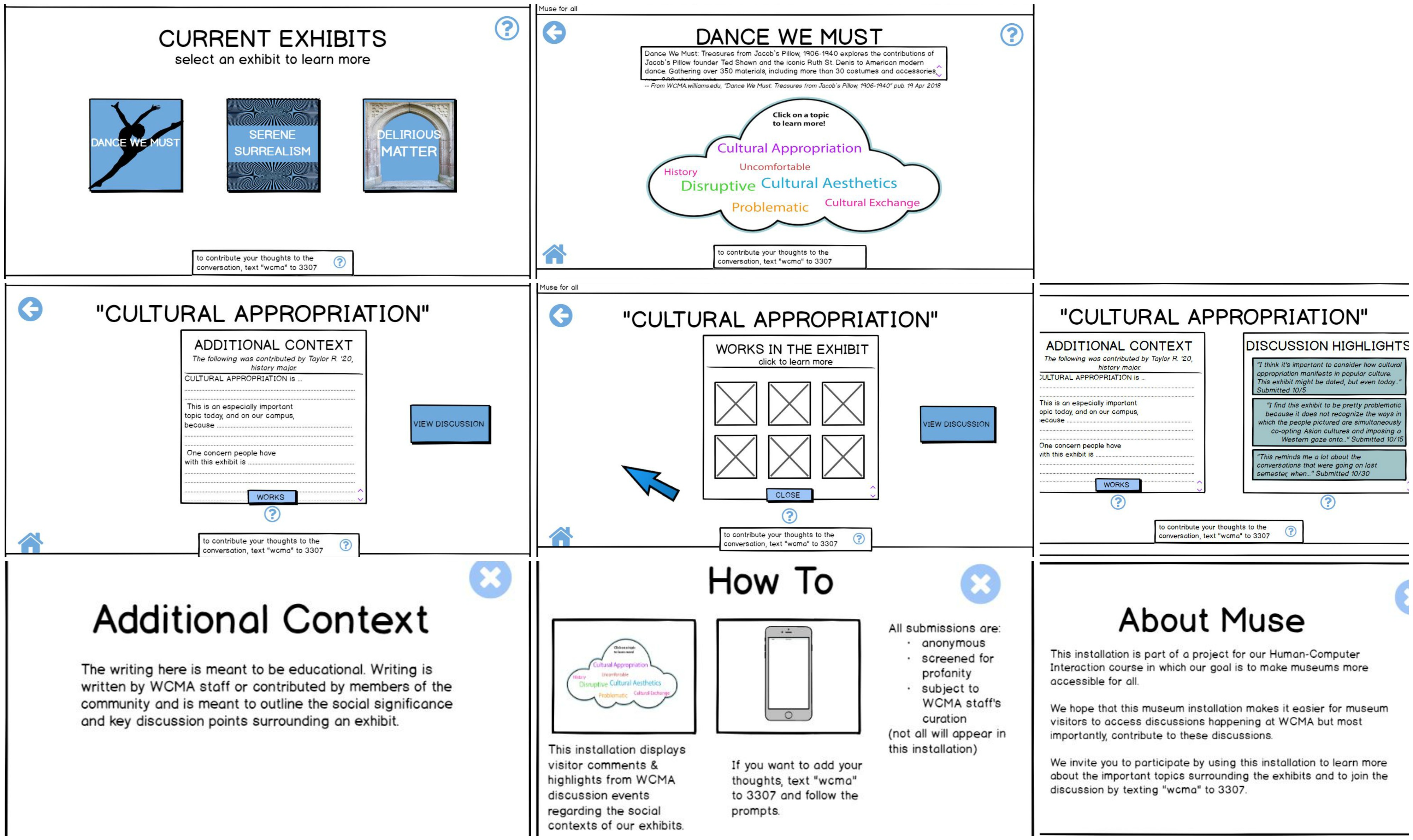
 Here is an overview of our digital mockup.
Our digital mockup retained all of the layout ideas and general themes of our final paper prototype, but here, we had to be more intentional about color. Per Iris’s feedback, we realized we had used a jarringly electric purple color for our interface, so we toned this down with a muted blue that was still aesthetically pleasing but not so harsh on the eyes. This was not something we even thought of when making our paper prototype. We also felt the constraints of working digitally when we could not implement a sliding animation in Balsamiq that we could easily simulate during our paper usability tests, so we could not fully convey how we wanted one screen of our design to move. A third change we made was to include more pictures. We changed the buttons on the home screen to each have some graphic inside of them, and we also decided to provide more information on each individual piece in an exhibit– so we also have a grid of images to display. We hope that this makes the app both less redundant by breaking up the text and more informative by providing info on each artwork.
Task 1, learning more about an exhibit and the discussion going on around it, is accomplished in much the same way as the paper prototype, only now, there is an additional button click required to get to the discussion. This button is hard to miss, and if you are already at the Additional Context page, you will be led to the discussion. We also, as I mentioned above, included information on each individual exhibit, so we are hoping that task 1 has more content driving it now.
Task 2, contributing to the discussion, is the exact same as it was before. There is a message at the bottom of every screen, in the same spot, telling the user how to text in their thoughts, how their thoughts will be considered, and where they will go. We also included a pop-up window triggered by clicking a question mark button to give detailed instructions on how to do this.
Discussion
This process of iterative design taught us a lot about how to create both a useful and unique project that will help make museums more accessible. Through this process and after receiving constructive criticism and advice we had to iterate through a few designs before deciding on a final design. We decided to change our design after realizing that a discussion board is not particularly novel and is not able to support the goals we identified in our research. This especially became apparent after conducting a Project Design Review. As a result, we created an interactive smartboard as our final design as effectively allows users to carry out identified tasks.
Our final design did not drastically change the tasks as a result of our usability tests. Users are able to complete the following tasks: 1) share and communicate thoughts via text message and 2) read content/discussion and other comments on the smartboard.
If more time was permitted, we could definitely have used more iterations upon our design as we were not able to conduct an extensive Project Design Review and receive additional feedback from classmates after presenting our ideas. However, I believe we made sufficient improvements to our design and this goes to show how iterations upon designs are essential.
Appendix
Contextual Inquiry (First one)
Project Design Review (Initial Design)