Overview:
For our museum installation, we used Balsamiq to create our digital mockup. The following shows a walk through of two important tasks of our design:
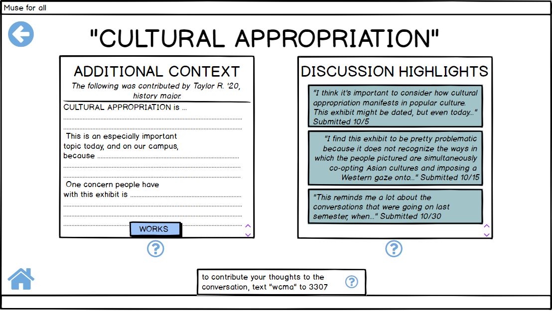
- viewing discussions happening at WCMA about particular artworks/ exhibits
- contributing to such discussions
We envision our product as a large touchscreen display in WCMA. Visitors would encoutner the display as they enter an exhibit or as they exit it, either priming their experience in the exhibit or learning more after an initial look.
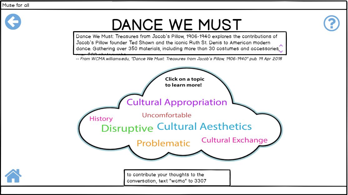
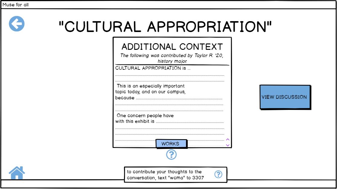
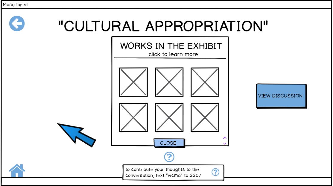
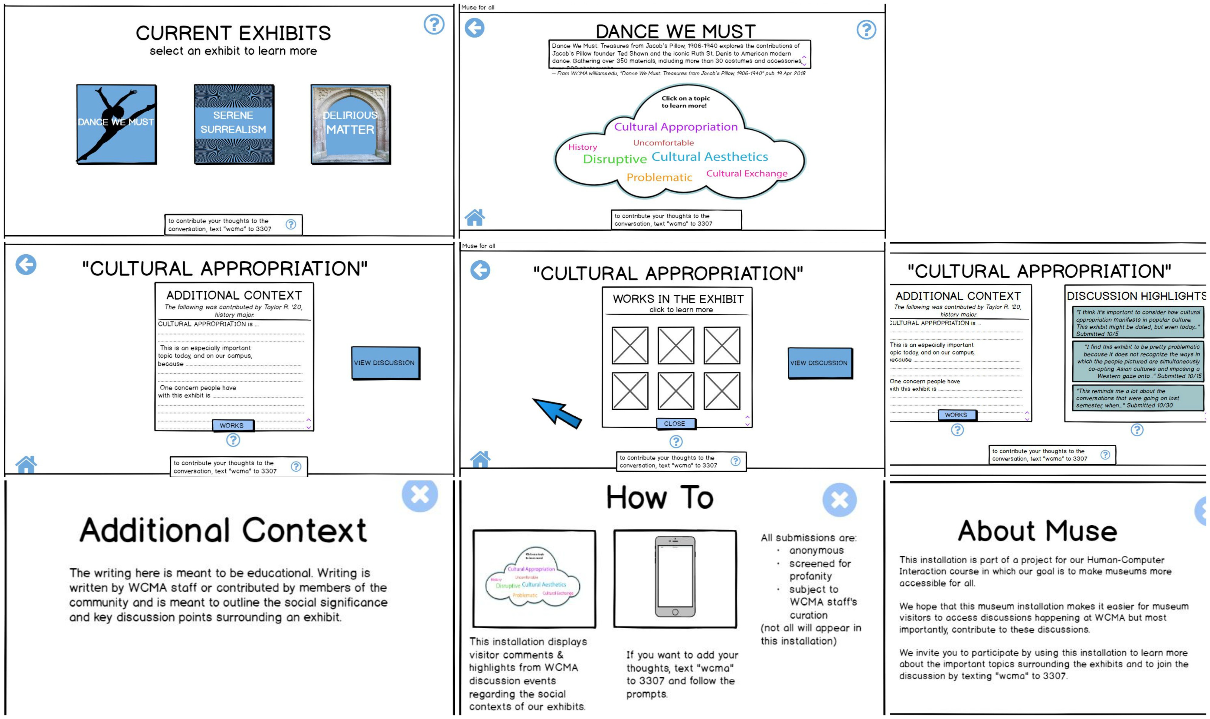
This is a picture of an overview of all the wireframes created for our project:
Task 1: Learn more about an exhibit and the discussion going on around it
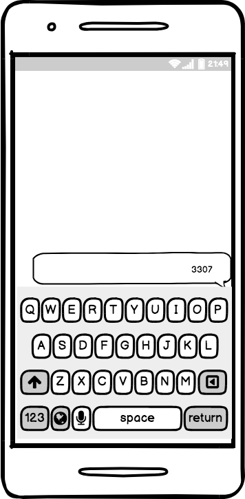
In order to view discussions about particular exhibits happening at WCMA, in this case the ‘Dance We Must’ exhibit, we start at the ‘homepage’ of our installation. On this page we can see the different exhibits currently on display at WCMA. The directions state to click on an exhibit to learn more about it. In this case the user will click the ‘Dance We Must’ exhibit. If the user is having trouble they can click on the question mark on the top right corner which takes them to the ‘About Muse’ page.  The user texts the appropriate museum code to start the process in contributing to conversation:
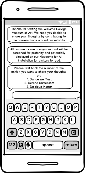
2) The user receives the following text as a response:
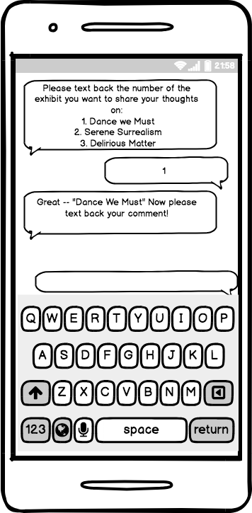
3) The user selects which exhibit to contribute to by texting the appropriate number:

4) The user receives the following text as a response:
5) The user types up comment and sends it in:
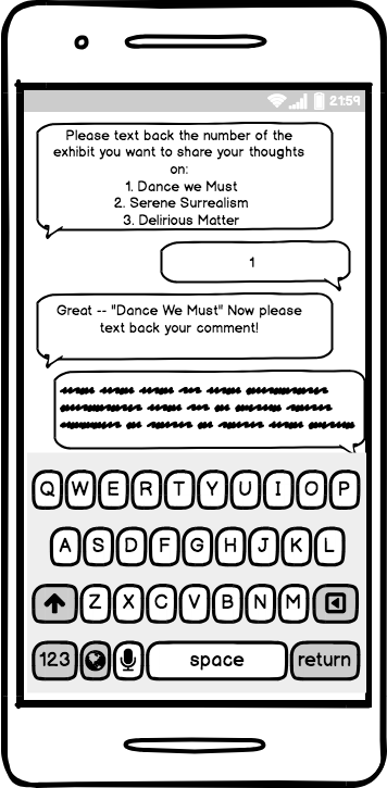
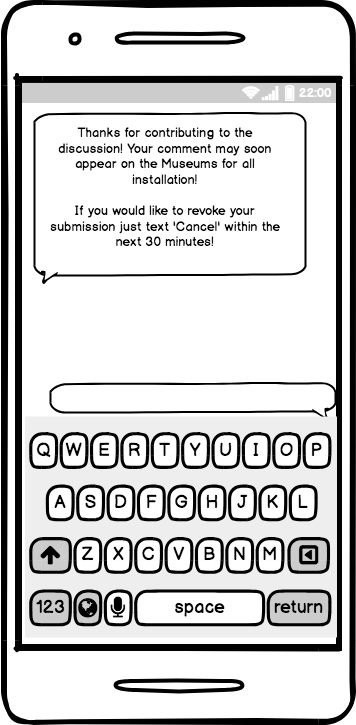
6) The user gets the following response and now completed the task:
Decisions and changes made in implementing the digital mockup:
- We could not implement a “sliding window” feature, which we had simulated in our digital mockup. Instead, one window moves to the left so another can appear beside it in a simple pop-up way.
- We changed the color scheme of our mock-up, seeing that on-screen, the original colors we had were rather unpleasing.
- We also included more colored areas, realizing that the plainness of the paper prototype showed a need for more color contrast in the digitized version.
- We changed the wording of the text responses when users text in their comments.
