Usability Tests
Over the last week and a half we conducted three usability tests. For the first test, we used our original paper prototype that we created. Then after conducting this first test and a cognitive walk through, we made changes to our prototype and conducted two more usability tests. The results and key takeaways from conducted these tests are outline below.
Usability Test 1 Over the weekend we conducted our first usability test with our paper prototype. We recruited a Williams student who is not in HCI and has no experience or background in art. We conducted the test in Eco Cafe at night when there were not a lot of people. We chose this environment because it was familiar, convenient and comfortable for the participant, as well as undistracting. We thought our participant was a good choice because he has an interest in technology but no background in design.
To start the test we introduced our project with some background about the HCI course we are currently in and a vague description of the goal/purpose of our project. We emphasized the importance of thinking aloud and oversharing his opinions and thoughts during the test. We then read him a simple background story: that he had just gone through the Dance We Must exhibit in WCMA and saw the smartboard on his way out. Then we asked him to complete the first task. Once he completed the first task we asked him to complete the second. Jamie facilitated the test while Dana took notes.
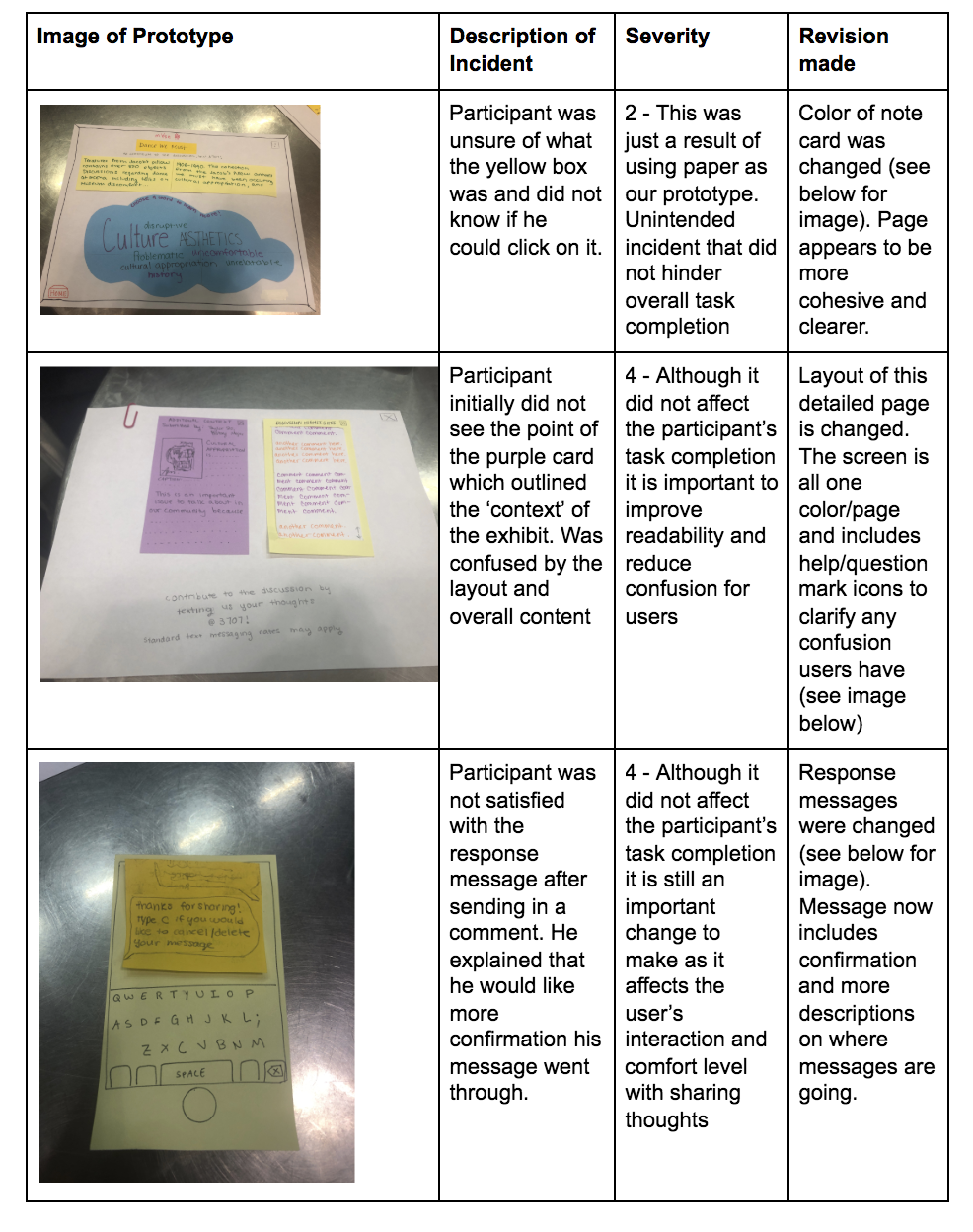
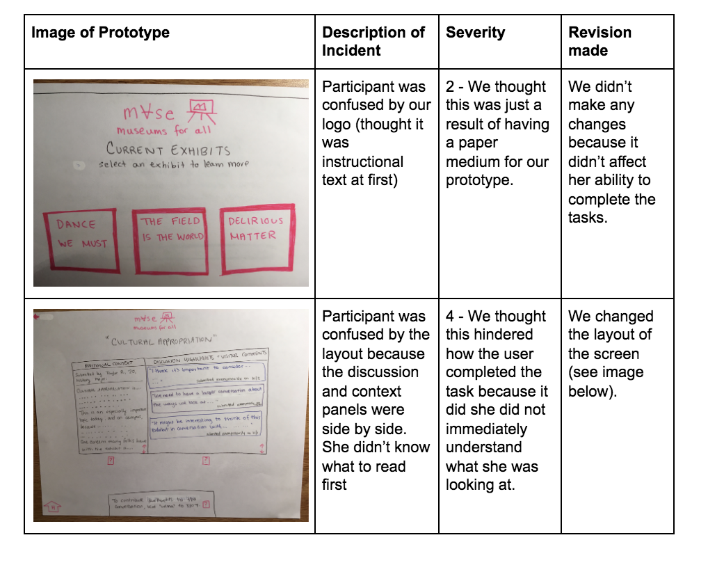
After completing this usability test we learned how a user who is not familiar with our class or background interacts with our product. We realized that key revisions need to be made including clarification of particular headers and clearer response messages. These change are outlined in the table below and further discussed below.
Usability Test 2
For our second usability test, our participant was a female undergraduate student at Williams College who identifies as a minority with little interest in visiting museums. We chose her as a participant since she is representative of the group we are trying to make museums more accessible to. This usability test was conducted in the evening at the living room of West College. This space was chosen since it has paintings in the interior resembling a museum. For this test, Elvira was the facilitator/computer and Jamie was the notetaker.
We followed the same procedure as our first usability test. We gave a very brief overview of who we are and the goal of our project. We gave her a description of a persona: she was a museum visitor who viewed the ‘Dance We Must Exhibit’ and wanted to learn more about what other people have to say. This was her first task. Her second task was that now after viewing what others have to say, she wanted to contribute to the discussion.
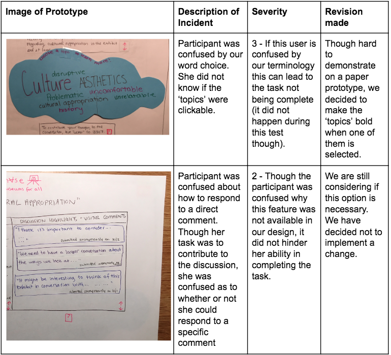
Throughout the usability test, we realized that our word choice may not be as clear as we thought when it comes to choosing a topic to learn more about. Moreover, our participant thought it was weird that there was not an option to reply to a specific comment. The ‘?’ was often used when the participant was confused. The key incidents are outlined below.
Usability Test 3
This week we conducted our third usability test with our paper prototype. We recruited a Williams student who is not in HCI and does not have a technical background or experience with art. We conducted the test in Lees on Thursday afternoon where there were plenty of people around but not crowded. We chose this environment because it was familiar and convenient for the participant. We chose this participant because she has no focused background with design or technology. We thought she was a good participant because her lack of technical background would give us some good insight into design.
We introduced our project with some background about the HCI course and a vague description of our goal and purpose of the project. We emphasized the importance of thinking aloud and oversharing opinions and thoughts during the test. Then we read her a background story: she had just gone through the Dance We Must exhibit in WCMA and saw the smartboard on his way out. Then we asked her to complete the first task: viewing other people’s comments on the work. We then asked her to complete the second task: sharing her own comments in response to the work. Dana facilitated the test while Jamie was the computer and Elvira took notes.
After completing this usability we realized we needed to redesign our content/context pages to be a different layout because putting them side to side makes it slightly confusing. Also she brought up good points that not all people might not have phones and would not be able to contribute to the discussion. She helped us realize that some design and layout revisions need to be made. These changes are outlined and described in the table below.
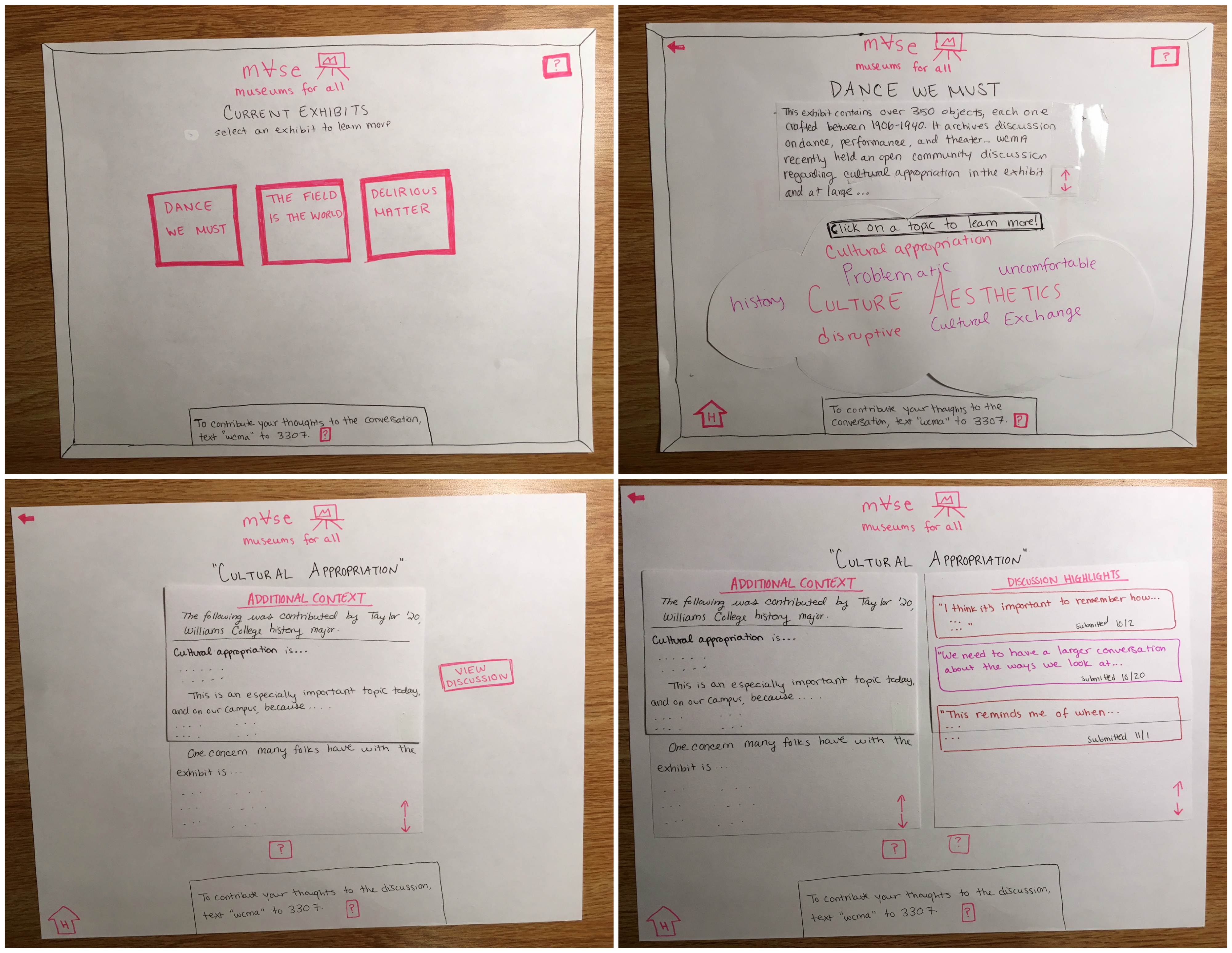
Final Paper Prototype
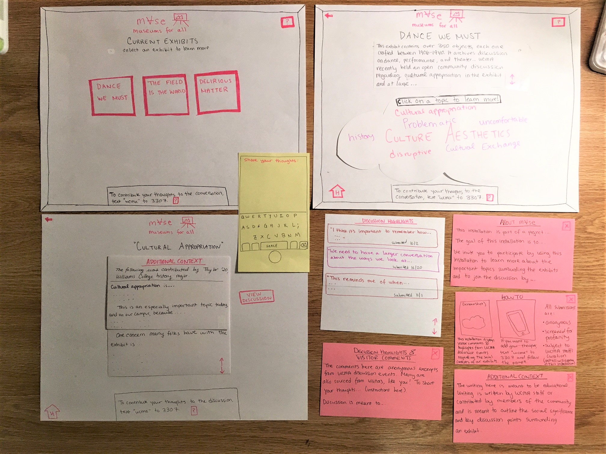
We made the following revisions to our paper prototype:
- One important piece of feedback we received was that the layout of our final page, which displayed our “Additional Context” and “Discussion Highlights” panes side-by-side, was confusing. Our tester noted that it was hard to distinguish what each one was when placed next to each other or whether they were two separate panels or one continuous panel. We took this observation very seriously because the additional context and discussion are the essential components of our design; we hope the former to add an educational aspect to museum visitors’ experience and for the latter to uplift certain voices. To fix this issue, we decided to now only display the “Additional Context” panel to start. There will be a button, “View Discussion,” which the user can click. Upon clicking, the “Additional Context” panel will slide over and the “Discussion Highlights” panel will appear next to it. We believe forcing the user to spawn the discussion panel will make it clear that these are two separate, but related, entities.
- Another revision we made was changing our word cloud to display words in various shades of pink. All of our clickable buttons on the interface are pink, but the word cloud words initially appeared in green, blue, purple, etc. Our tester noted that the instructions told her to click a topic to learn more, but that she was hesitant to do so because they were not pink. We definitely wanted to fix this because it can be very frustrating to work with counter-intuitive instructions. We decided to change all of the clickable word cloud words into shades of pink to be more consistent with our theme.
- We also observed testers’ confusion with our “Additional Context” panel and what it means. Part of this might be that our paper prototype does not display real content. At the top of the panel it says the content is “Submitted by Taylor R. ‘20, history major,” but one tester noted that they thought this was a comment by some Taylor R. We realized we needed to be clear in where we are sourcing our content from so that people can get the information without being bogged down by confusion over little details. To fix this, we changed our “Additional Context” panel to be more descriptive about where the content came from and also to provide a visual break between this info and the beginning of the text.
Here is the workflow for performing Task 1: Learn more about an exhibit and the discussion going on about it.
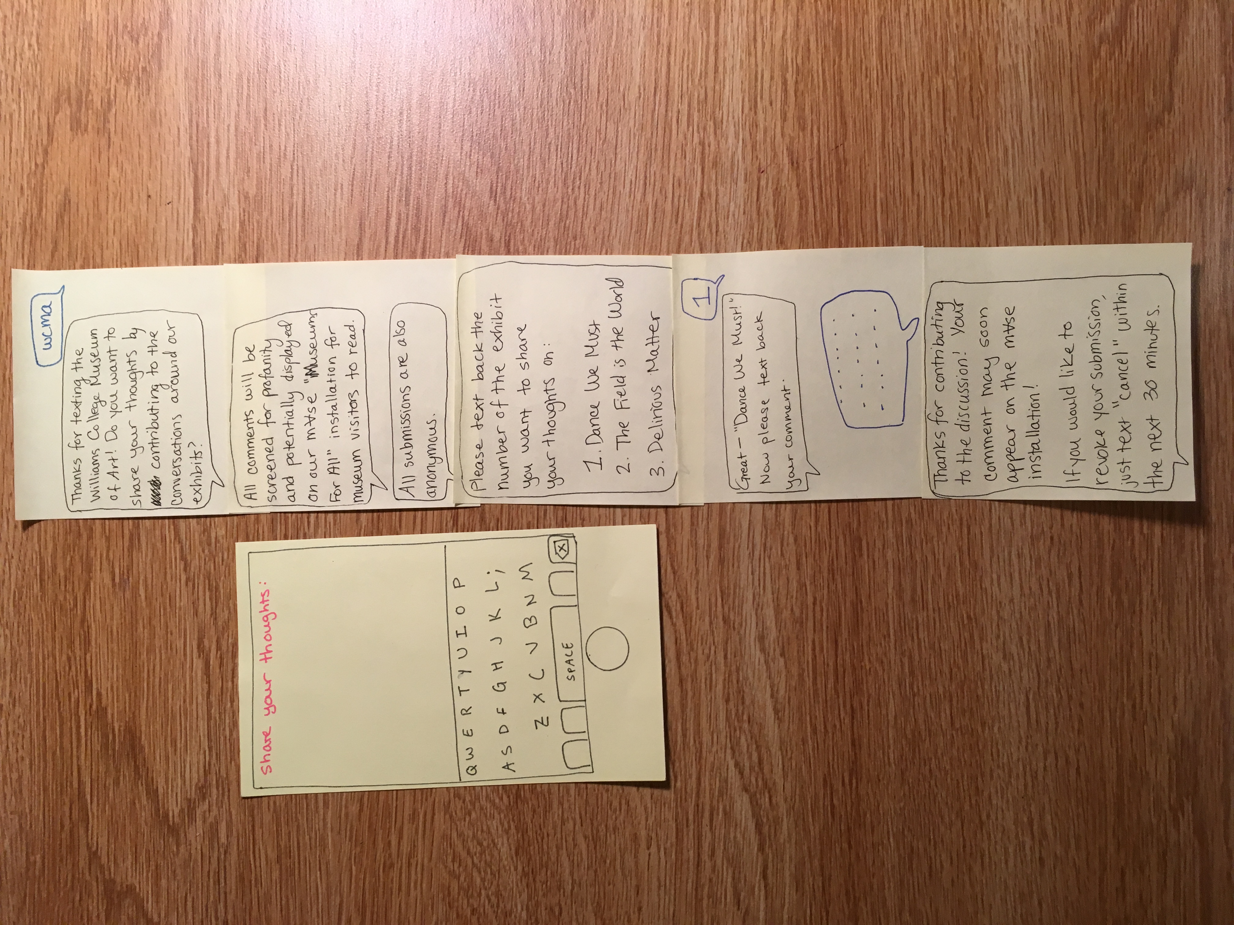
And here is the workflow for performing Task 2: Share your thoughts/contribute to the discussion.
