Cognitive Walk-through
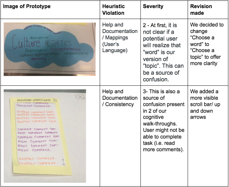
During class we conducted three cognitive walk-throughs to determine if potential users will understand and develop the same conceptual model we have. For our first cognitive walk-through our persona was a museum visitor who reads about the exhibit and is very opinionated about cultural appropriation. His task was to share new comments in response to pre-existing comments. During the traversal of the action sequence, we discovered that it is quite simple to select an exhibit from the homepage of our interactive smartboard. However, when it comes to selecting a word to learn more about (in this case “cultural appropration”) it is not clear if “word” is an appropriate description for “topic.” Moreover, we realized there was no scroll bar for our comment section.
For our second cognitive walk-through, our persona was an occasional WCMA visitor who felt ambivalent about the Dance We Must exhibit. His task was to get more information about a particular exhibit and read about what others have to say. Here, the action sequence was the same. We saw a similar problem with word choice which is why we decided to change “choose a word to learn more!” to “choose a topic to learn more!” on our design. For our final cognitive-walk through we had a persona who was visiting the Dance We Must exhibit for the third time and wanted to leave a comment. This walk-through revealed that leaving a comment from the homepage is a doable task.
First Usability Test
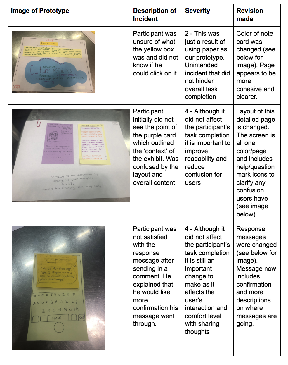
Over the weekend we conducted our first usability test with our paper prototype. We recruited a Williams student who is not in HCI and has no experience or background in art. We conducted the test in Eco Cafe at night when there were not a lot of people. We chose this environment because it was familiar, convenient and comfortable for the participant. We chose this participant because he has no background in art but interest in computer science. We thought he was a good participant because he has an interest in technology. We thought this might be good because, firstly, he would be an enthusiastic volunteer and secondly, he would bring a certain critical response to how he interacted with the technology, as somebody who studies technology himself (albeit in a different way).
To start the test we introduced our project with some background about the HCI course we are currently in and a vague description of the goal/purpose of our project. We emphasized the importance of thinking aloud and oversharing his opinions and thoughts during the test. We then read him a background story, summarized above and asked him to complete the first task. Once he completed the first task we asked him to complete the second. Jamie facilitated the test while Dana took notes.
After completing this usability test we learned how a user who is not familiar with our class or background interacts with our product. We realized that key revisions need to be made including clarification of particular headers and clearer response messages. These changes are outlined in the table below and further discussed below.
Revised Design
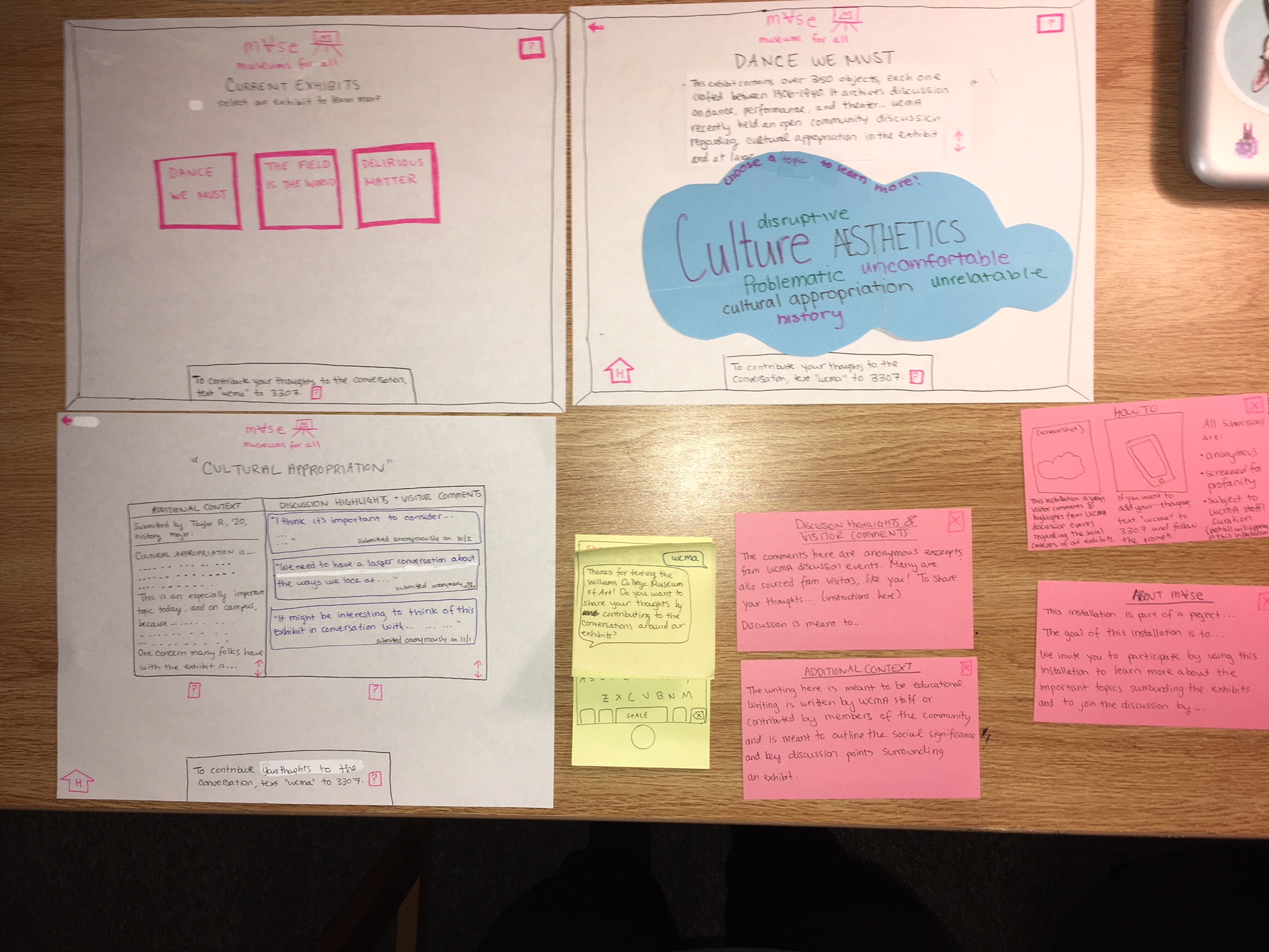
We made several changes in this new iteration of our design, including:
- Offering clearer instructions on how to use our interface
- Making the instructions/help button more noticeable, since we noticed during one of our usability tests that although our help button answers our tester’s questions, they did not notice it
- Offering better instructions for the text submission system
- Showing the instructions to text in your thoughts on every screen, and in the same spot on each screen for consistency
- Using clearer wording in “choose a topic to learn more”
- Combining the “ADDITIONAL CONTEXT” and “DISCUSSION HIGHLIGHTS” screens into one, which someone suggested during our in-class usability test
- Scroll feature signifiers wherever scrolling is possible
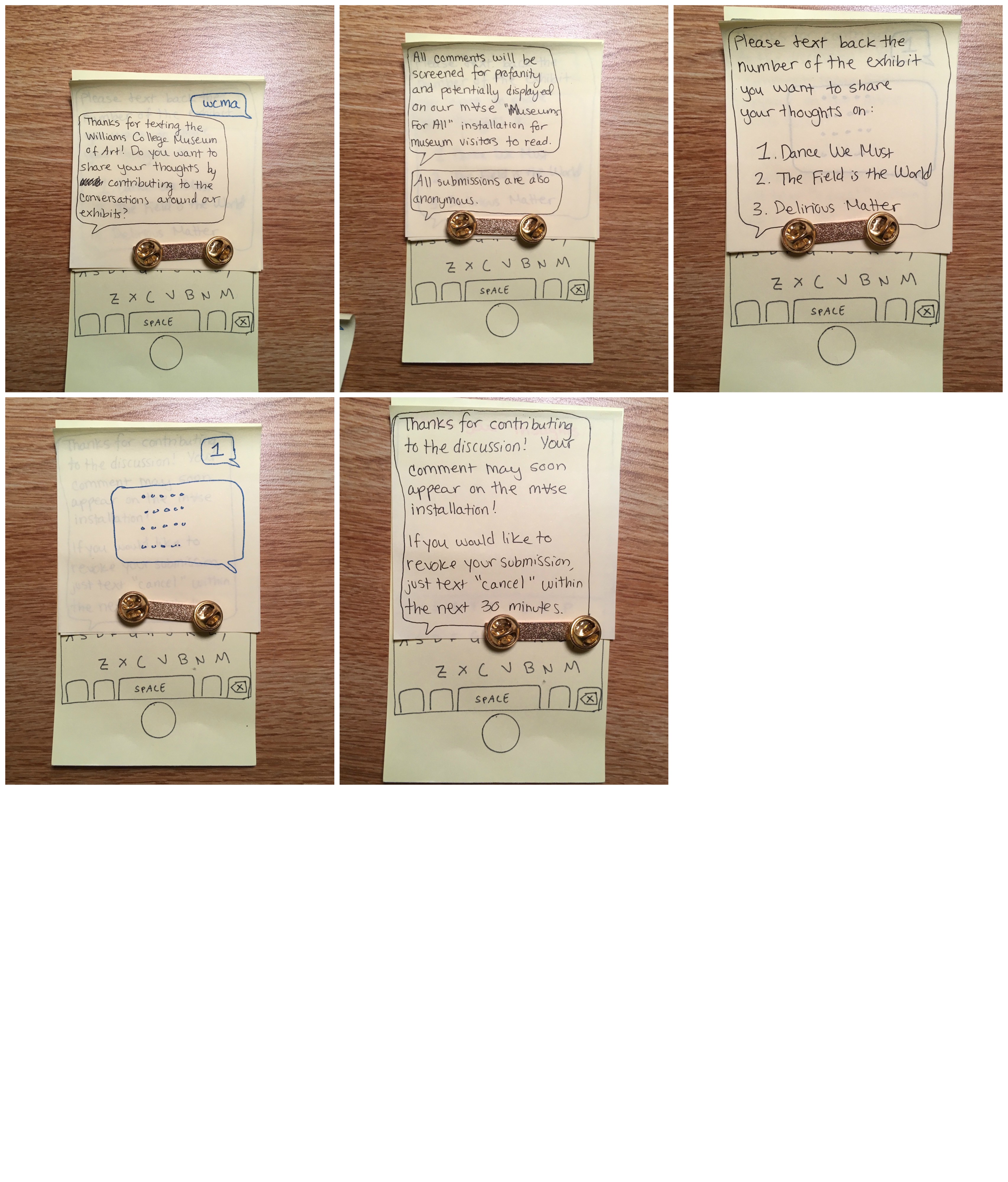
The following images are step-by-step screens. The yellow index card, if you can’t tell, is a phone (admittedly, we used a metal pin to hold down the curling sticky notes, so please ignore this in the photos). The pink index cards are pop-up screens.
Task: Learning more about an exhibit and what people have to say about it
 Above: In the second and third screen, the user clicked on the ? buttons in the top right and bottom.
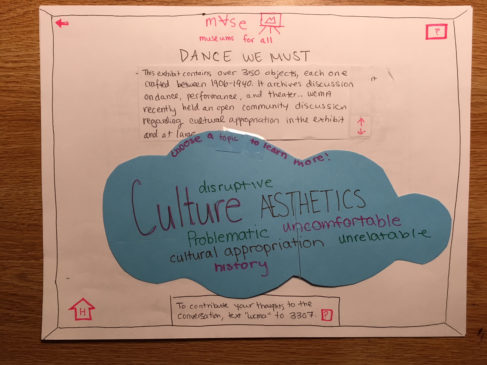 Above: After clicking on an exhibit (Dance We Must), the user is brought to this screen.
 Above: After clicking on a topic, the user is brought to this screen. They have now accomplished their task.
Task: Sharing your thoughts/contributing to discussion
Next Steps
For the rest of our usability tests, we plan on recruiting another Williams student who is less interested in Division 3 courses/ technology. We would like to know if not having a technology background will significantly impact the way users will interact with our design. We would also like to recruit a museum visitor or WCMA staff as this would provide more insight as to how our design can actually be used in museums. For the additional tests, we plan on switching roles, so all team members can feel comfortable being the facilitator. As a new approach, it would be interesting to record these tests for future reference.