Heuristic Evaluation 1
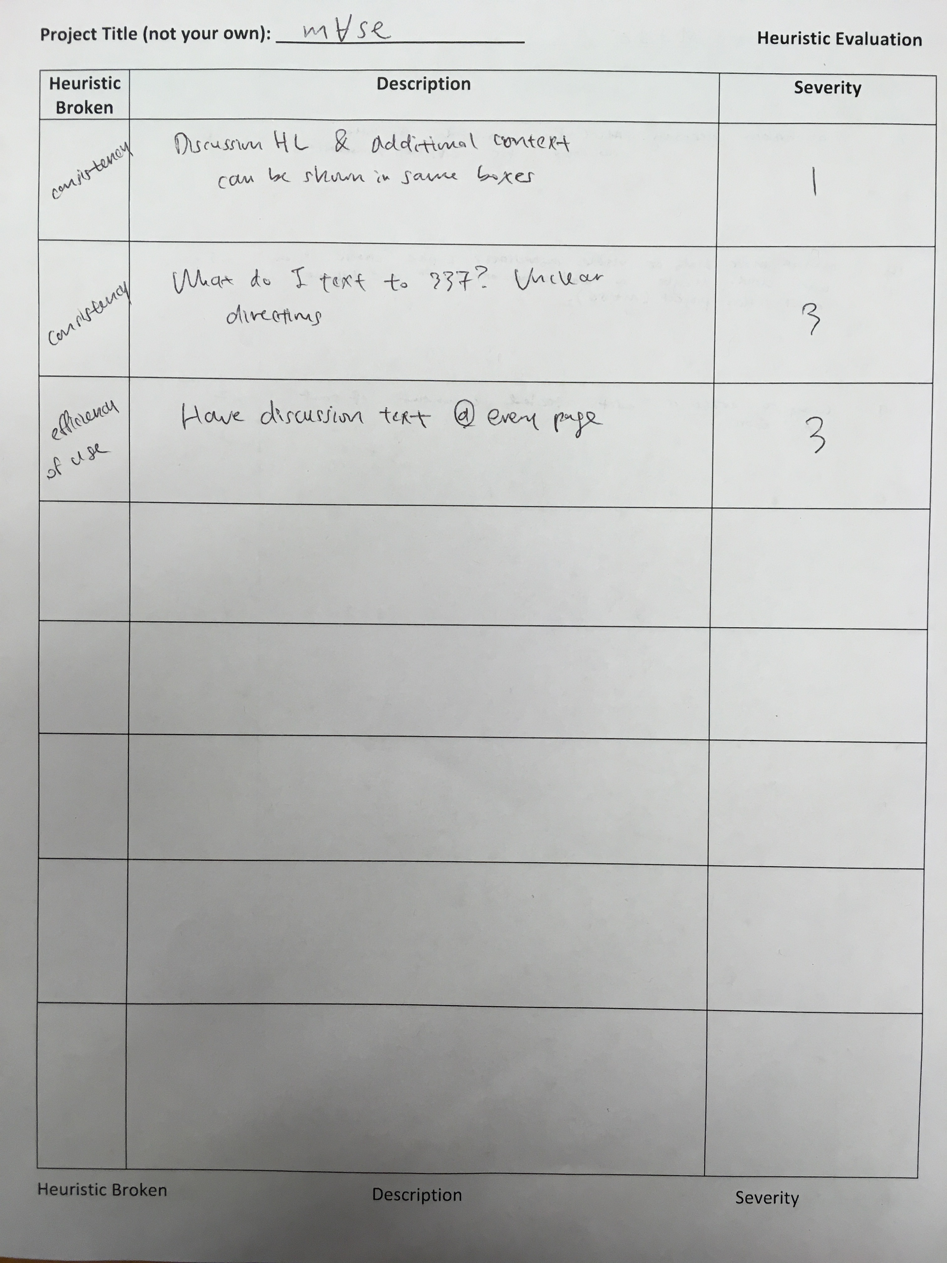
Conducted by Elvira and Dana. Evaluted by Kenneth. In class we conducted two heuristic evaluations of our paper prototypes. For the first heuristic evaluation, Jamie and Elvira conducted the evaluation. Jamie was the facilitator/computer while Elvira observed and took notes. Figure 1 shows the Heuristic Evaluation table completed by the other team.
 Figure 1: Heuristic Evaluation 1
Heuristic Evaluation 2
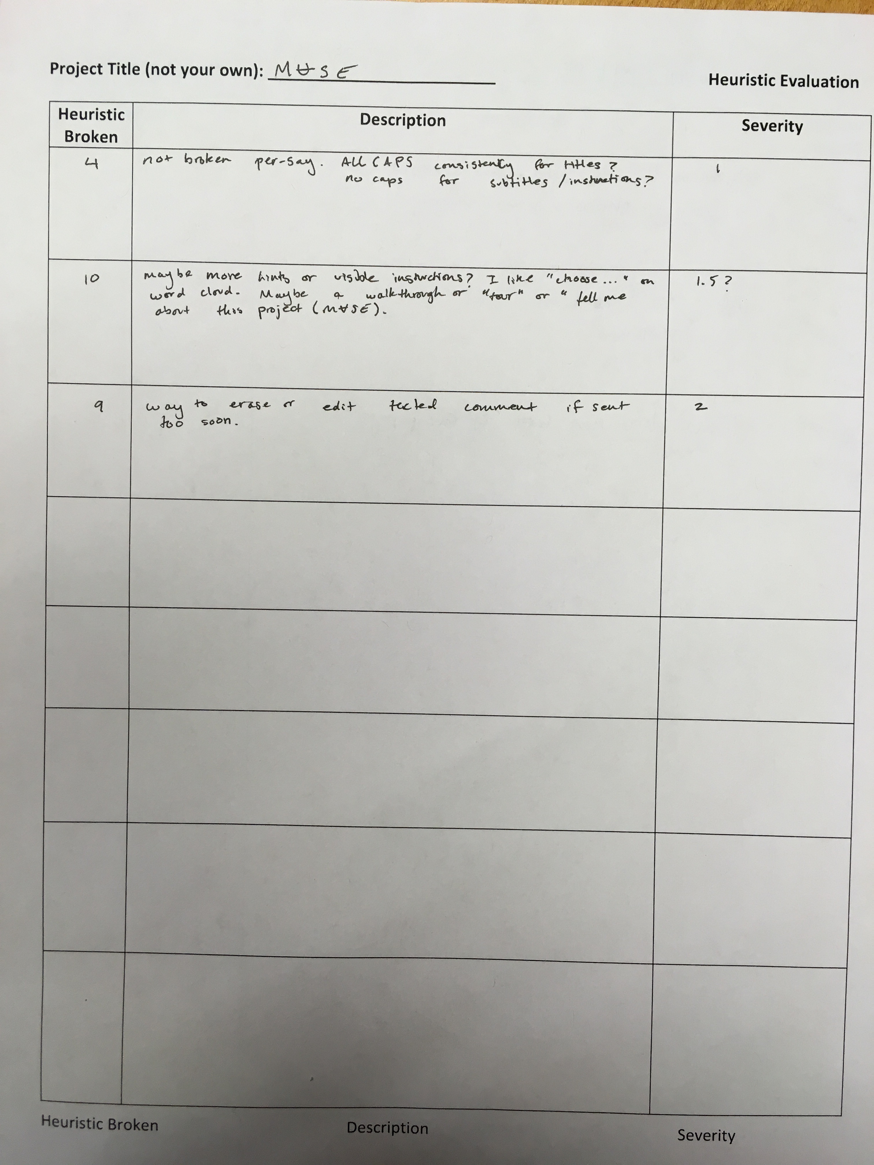
Conducted by Elvira and Jamie. Evaluated by Landon. For the second heuristic evaluation, Dana and Elvira conducted the evaluation. Elvira mainly facilitated the evaluation while Dana took notes and was the computer. Figure 2 shows the Heuristic Evaluation table completed by the other team.
 Figure 2: Heuristic Evaluation 2
Overview of Heuristic Evaluations
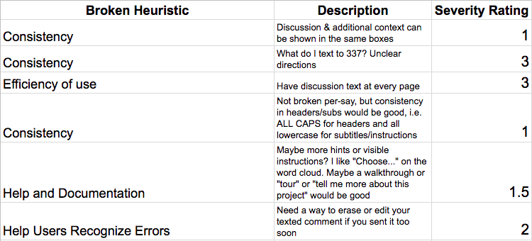
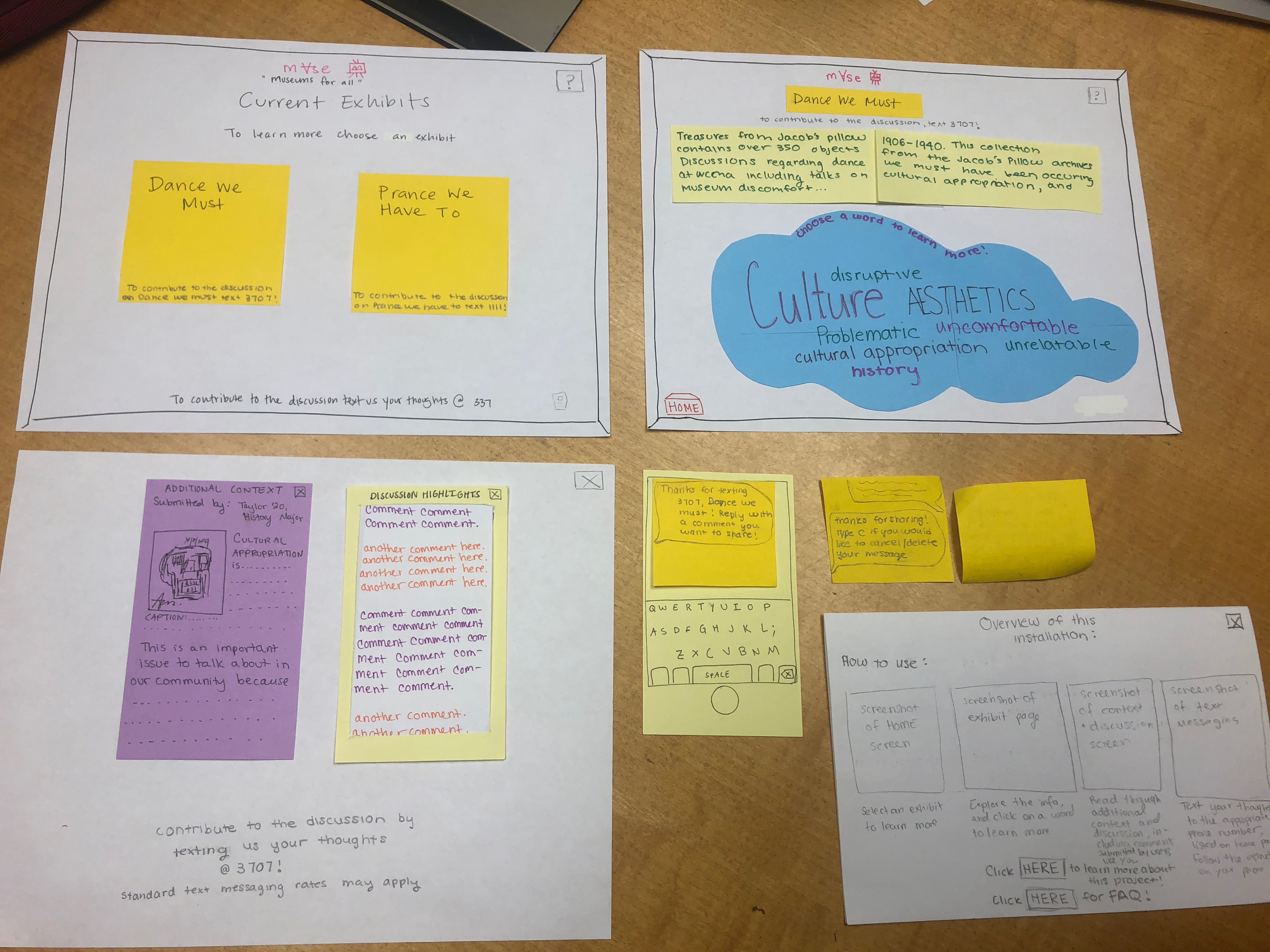
An overview of the heuristic evaluation table is outlined in Figure 3. An overview of our paper prototype can be seen in Figure 4.
 Figure 3: Overview of Heuristic Evaluations
Steps for Revising Our Paper Protoypes
- Include the information to text your comments in on every screen, not just the first one. These instructions can simply be added in to the same spot on each screen so they’re always available.
- We need to provide better instructions on what users should text in, making it clear that they can share any thoughts they have about the exhibits, specific pieces, or the social context in which the exhibit lives.
- We can also simplify our interface by simply combining the discussion panel and context panel into one window.
- One person suggested we include additional context on individual art pieces in the gallery, too. We decided not to implement this change because we thought it strayed from our purpose; we want our design to provide information and discussion space for the social context the gallery exists in, but we did not think offering a detailed catelog with each piece would help achieve this.
- We will be more consistent about our text formatting, choosing ALL CAPS for headers/titles and following regular conventions for subtitles and descriptions.
- We also want to include clearer instructions on how to use the interface, as well as a “Tell Me More” feature that describes the purpose of the design.
- We also want to allow the user to revoke their comment within 20 minutes after they send it in, in case they made a spelling mistake or change their mind.
Figure 4: Our Revised Paper Prototype

We revised our paper protoype in the following ways:
- We included a ? button on each screen. Clicking this ? button will tell the user more about our project and also provide them with instructions on how to use the interface. This also includes a FAQ section and instructions on how to text in comments.
- We changed our system for texting in comments to allow users to CANCEL their comment within a certain amount of time.
- We also now have a different phone number for each exhibit that the user can text to, to alleviate some of the heaviness in the texting interface.
- We included the messaging “To contribute to the discusion, text to NUMBER on every screen.
- We combined the context and discussion panels into one window for simplicity.